By Ryan Gowdy
Few decisions in a home renovation carry as much leverage as paint color. It is the least expensive change you can make to a room and one of the most transformative. It is also the one most people get wrong — not because they chose a bad color, but because they chose it in the wrong way. Once you understand the variables at play, you can approach any room with confidence.
Key Takeaways
- Light determines how every color will actually look — the same paint reads entirely differently across rooms and times of day
- The function and mood of a room should guide its color before any trend consideration does
- Testing samples on the actual wall in the actual room is non-negotiable
- Color flow between rooms should be planned for the whole home, not just room by room
Start With Light, Not Color
The most important factor in paint color selection is not the color itself — it is how light interacts with it in your specific room. The same chip can look entirely different in a north-facing room, which receives cool indirect light all day, versus a south-facing room flooded with warm afternoon sun. In California, where natural light is abundant and gets direct sun exposure for much of the year, this matters more than in most other climates.
Observe the room at different points during the day — morning, midday, and evening — before committing to any color. Note whether the light is cool or warm, direct or diffuse, and whether artificial lighting at night shifts the temperature significantly. A warm creamy white that looks inviting in afternoon light may read yellow or dingy under overhead fixtures. A soft sage that feels grounded at noon may feel heavy by dusk.
Light Variables to Assess Before Choosing Color
- Room orientation: north-facing rooms receive cool indirect light; south-facing get warm sustained light; east and west rooms shift significantly through the day
- Ceiling height and window scale: rooms with high ceilings and generous windows handle saturated colors differently than compact rooms
- Artificial lighting type: warm bulbs shift colors toward yellow; cool-spectrum bulbs push toward blue or gray
- Finish choice: higher sheens reflect more light and make colors appear brighter; matte finishes absorb light and read slightly darker than the swatch
Define the Mood, Then Find the Color
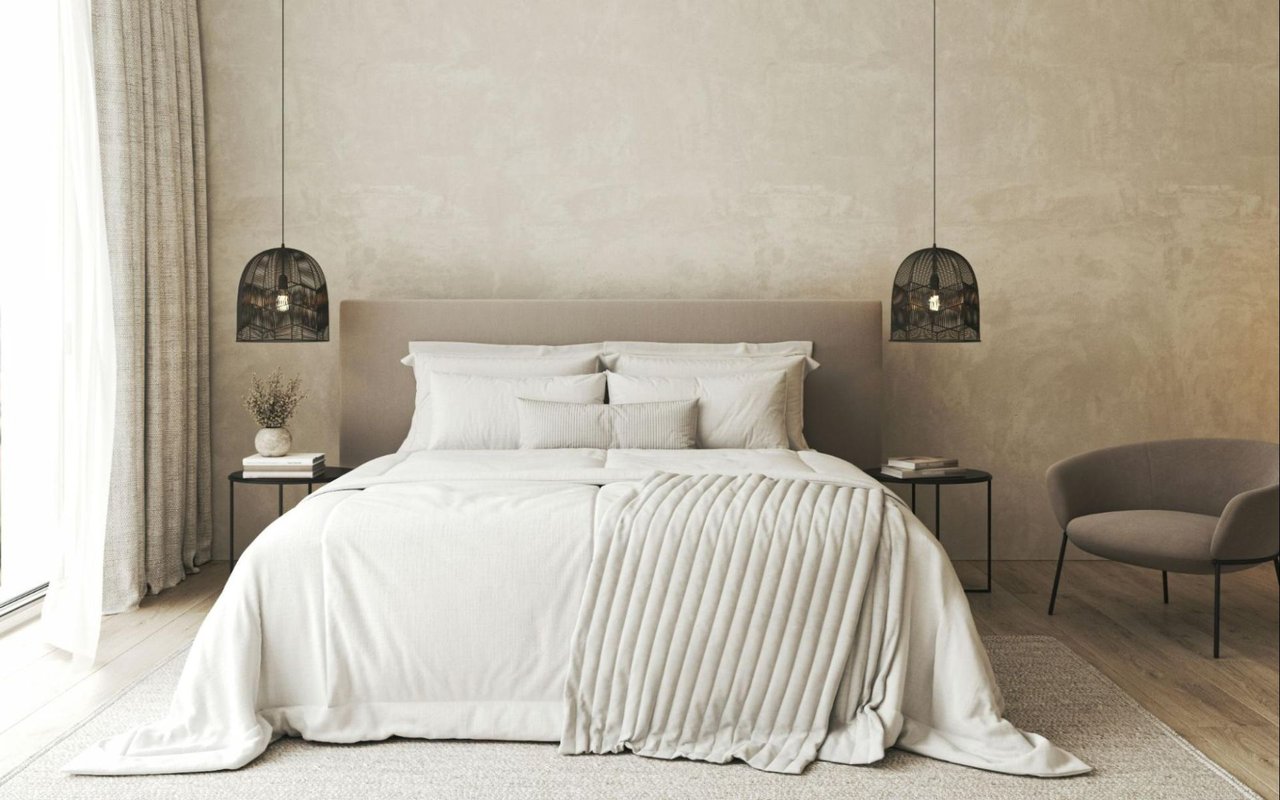
Before scrolling through paint decks, decide what you want to feel in the room. Rooms designed for social energy — dining rooms, kitchens, entertaining spaces — respond well to warmer tones: terracottas, warm taupes, earthy reds, and the earthy ochres prominent in interior design through 2025 and into 2026. These feel inviting without being aggressive. Living rooms and primary bedrooms benefit from the opposite: muted greens, dusty blues, warm off-whites, and soft neutrals that signal rest and ease.
Home offices present a different calculation. Deep, saturated colors — charcoal, navy, forest green — work well here because they create focus and reduce visual distraction. They make a room feel intentional. The current design direction has moved away from the cool blue-gray palette that dominated the previous decade toward softer, nature-inspired tones sage, warm greige, and complex neutrals that shift subtly with the light.
Color by Room and Intended Mood
- Living room: warm neutrals and muted greens create calm without flatness
- Primary bedroom: soft, complex tones with low saturation — dusty lavender, warm linen, hazy sage
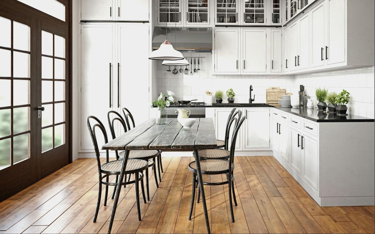
- Kitchen: warm whites age better than stark whites, which show wear and yellowing quickly
- Home office or study: deep, saturated hues build focus and sophistication — navy, charcoal, and forest green are all strong candidates
- Bathrooms: light, cool tones feel clean; small bathrooms can handle more drama than most people expect
Test Before You Commit
No matter how well a color looks on a chip or a screen, you need to see it on your actual wall before committing. Paint large test patches directly on the wall — at least a foot square — and observe them across multiple days and lighting conditions. Apply two coats; a single coat will not give you an accurate reading.
Paint your test patches adjacent to the room's fixed elements: trim color, flooring, any cabinetry that will stay. Color looks fundamentally different next to warm wood tones versus white trim versus stone tile. The goal is a color that works within the complete composition of the room, not one that looks right in isolation.
How to Test Colors Effectively
- Paint samples directly on the wall — poster board distorts the reading
- Apply two coats of the sample before assessing
- Live with the sample for at least two to three days before deciding
- Assess at morning, midday, and evening under both natural and artificial light
- Test in multiple rooms simultaneously if selecting a whole-home palette — adjacency matters
Create Flow Without Uniformity
A common mistake in whole-home color selection is either painting every room the same neutral — flat and institutional — or choosing completely unrelated colors for each space, which feels chaotic. The goal is cohesion with variation: a palette that gives each room its own identity while reading as a unified whole when seen from doorways and hallways.
One reliable approach: select a single unifying neutral for all trim, doors, and ceilings throughout the home. This ties rooms together regardless of how varied the wall colors become. From there, choose wall colors within a shared tonal family — all warm, or all cool, or all nature-inspired — and let saturation and value shift from room to room rather than the color temperature itself.
Frequently Asked Questions
Should I follow 2026 paint color trends when choosing colors for my home?
Trends are a useful reference but should not drive the decision. The more important question is whether a color works in your specific space, serves the mood of the room, and will feel right in three years. That said, the current move toward warm, nature-inspired tones reflects how people genuinely want their homes to feel — and those palettes tend to be more forgiving and livable than either stark white minimalism or highly saturated statement colors.
How do I choose colors that will hold up when I go to sell the home?
Warm neutrals and soft, complex tones photograph well and read as move-in ready to buyers. Highly personal or strongly saturated colors can work beautifully in person but create friction in listing photos and showings. If you plan to sell within a few years, staying within a warm neutral palette — creamy whites, warm greige, soft sage — gives you a home that feels designed and a listing that photographs cleanly.
Is it worth hiring a color consultant?
For a whole-home repaint or significant renovation, yes. A consultant working with physical samples in your specific light conditions will save you the cost of repainting colors that looked right on a screen and wrong on the wall. The fee is modest relative to a repainting mistake across significant square footage.
Contact Ryan Gowdy About Your Los Altos Home
Whether you are preparing a home for sale, reimagining a space you have lived in for years, or touring properties and thinking about what you would change, I am happy to talk through what works in this market.
Reach out to me, Ryan Gowdy, and let's talk about your home.